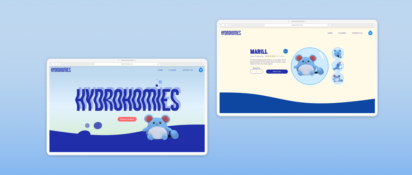
Hydrohomies case study banner of a desktop screenshot of the home page and product page

HydroHomies

Crafted the user interface and built a company website for a hypothetical Pokémon plush brand, focusing on creating a responsive site that reflects the brand identity through clear indicators of interactivity, accessibility, and thoughtful UI design.

ROLE

UI designer

Web developer

TEAM

Michelle Wang

Leanne Ngong

Calvin Alexan

TOOLS

HTML

CSS

Javascript

Figma

TIMELINE

October 2023-November 2023

Overview

Hydro Homies was an academic project focused on designing and developing a product website through html, css and javascript. The product site features a landing page, product pages, shop page, and a checkout page for the Sitting Cuties Hydro Pokémon plush line. I was responsible for designing the interface and visual direction, as well as the development process including responsiveness.

OUTCOME

A Product Website with Playful Designs

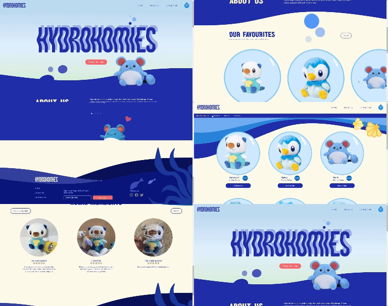
Embracing the playful charm of Pokémon plushies, I designed vibrant and playful graphics and UI, including small bubbles for image containers and bold, contrasting colours.

gif of hydrohomies on desktop navigation through site pages gif of hydrohomies on desktop navigation through site pages

View the final website↗︎.

View the Github Repository↗︎.

Project Goals

Responsiveness

Build essential pages for Hydro Homies and ensure they are accessible at all screen sizes

Expressive Design

Capture the playful essence of water Pokémon plushies with engaging and unique design.

Clear Interaction

Incorporate elements that indicate interactivity for interactive web elements

IDEATION

The Drawing Board

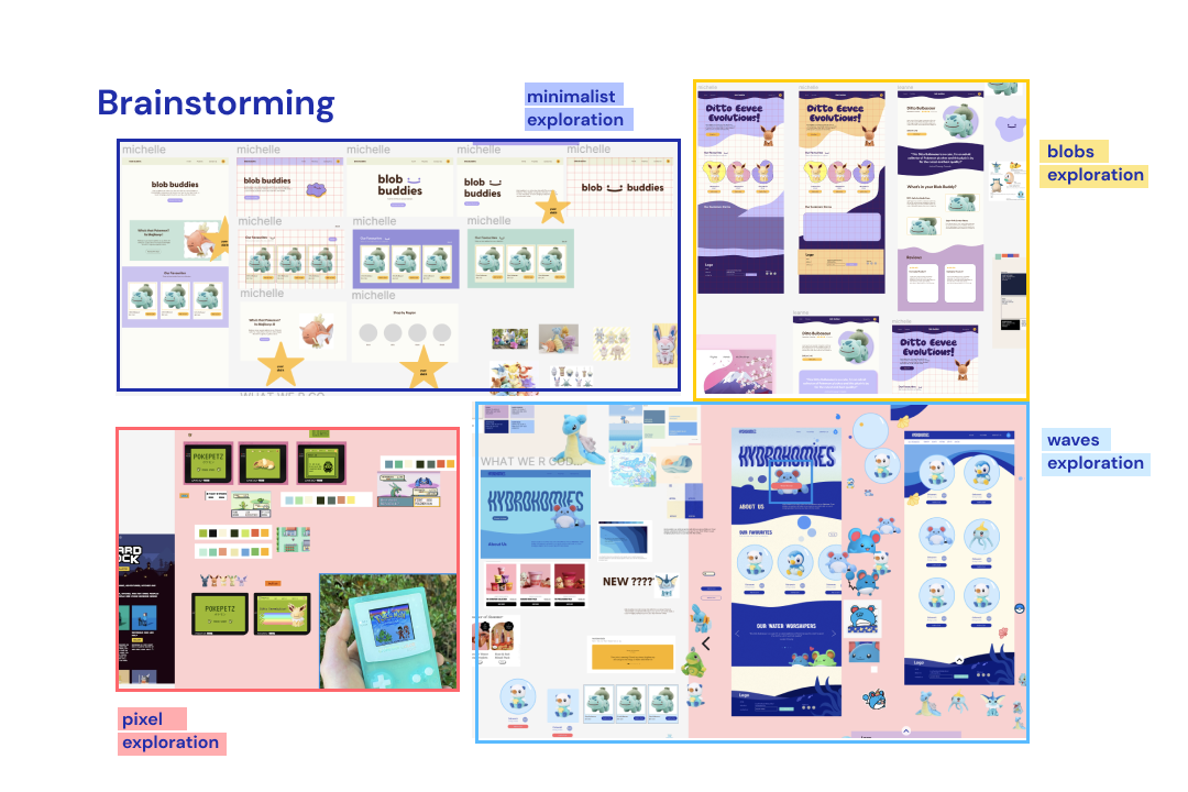
The first few steps in this project consisted of establishing a strong visual identity for the brand. We ran into a roadblock at first, as we confined ourselves to a style-guide that preceded this project, however, we expanded from that and explored various design concepts to broaden our scope.

screenshots of style exploration including minimalist, blobs, pixel, and wave art directions

DESIGN PROCESS

Feedback

Initially, we presented a pastel coloured minimalist visual identity in our feedback sessions, but we received feedback from the teaching team that it was not a strong art direction that reflected the brand due to its genericness.

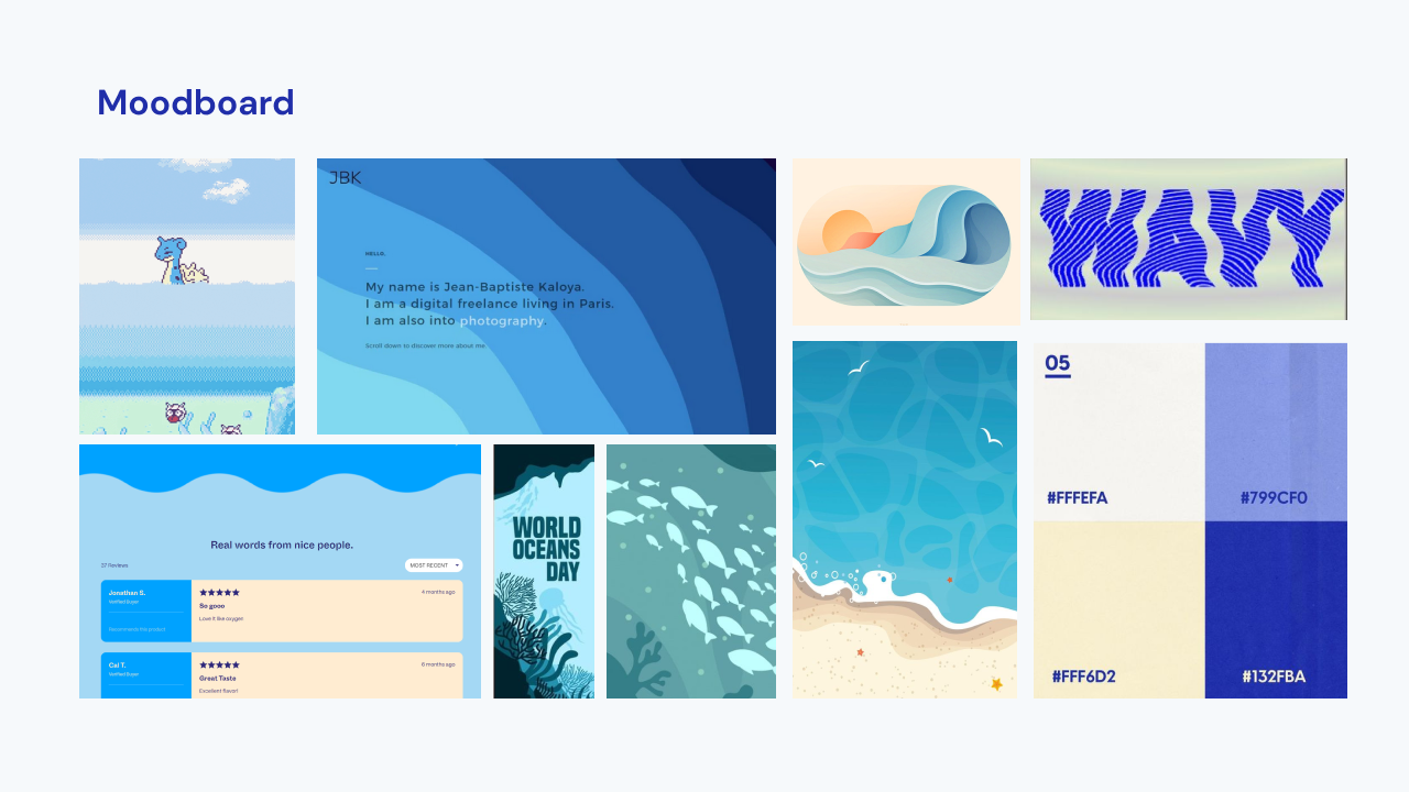
Considering that, we decided to move away from this direction completely, in favour for something that aligned with the brand name more. We renamed the company to "HydroHomies" selling hydro Pokemon plushies and I created some water themed graphics and currated a moodboard, exploring the path of wavy ocean themed imagery, playing with various colour palettes.

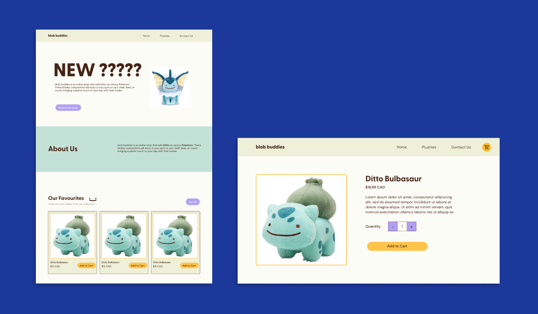
old pastel minimalist designs of home page and bulbasaur product page
moodboard collage of wavy blue images with beach and sea themes

DESIGN PROCESS

Style Guide

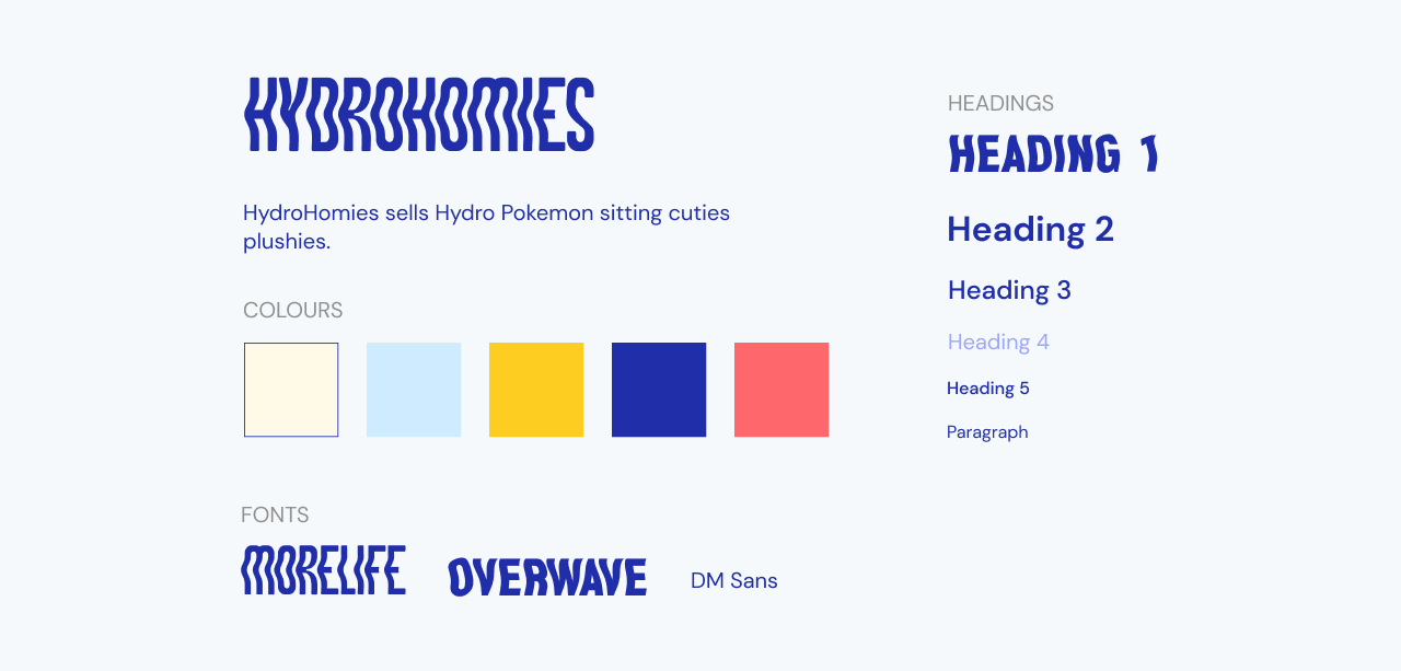
After settling on the art direction, creating a style guide helped the team be on the same page in terms of visual design, with clear visuals for what each web element would look like. I created this style guide on Figma after each members input on what the elements should look like.

styleguide of hydrohomies including the wavy font headers, colour scheme (cream white, light blue, dandelion yellow, deep blue, and pinkish red), and fonts

DESIGN PROCESS

Interactive Elements

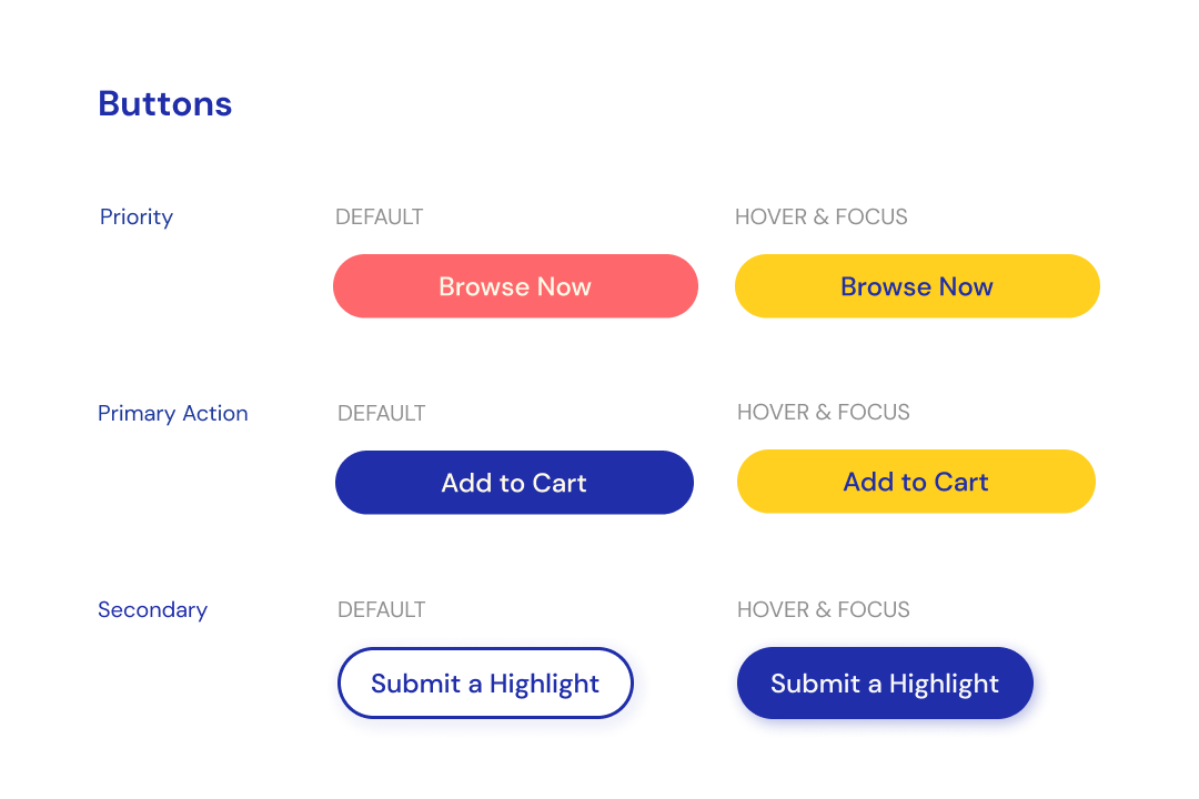
One of our main goals was to ensure that all interactive elements are clear that they are meant to be interacted with. For example, buttons need to be clear that they are clickable, and so are image links. I played a role in designing buttons, utilizing drop shadows and vibrant colors to emphasize their interactivity. We intentionally kept buttons and interactive links in a uniform color to provide users with a clear indication of interactive elements. Additionally, I coded and designed various hover and focus states, implementing color changes for buttons and introducing a playful shake effect when users hover over a Pokémon plush in the shop.

image of the different styles of Hydrohomies buttons

CODING PROCESS

Bringing Designs to Life

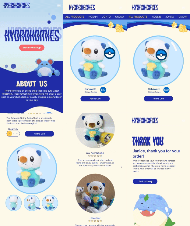
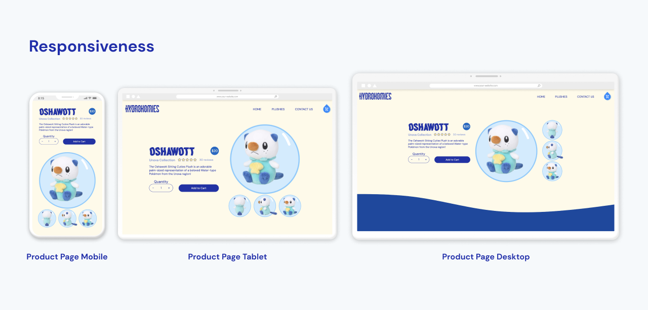
Our team used Github so that we could all collaboratively code and work on it at the same time. I fully coded the product page, and worked on the shop page and checkout page with another team member, where I was responsible for implementing animations, and the grid layout behavior. I was also responsible for creating responsive layouts for each of the pages that I coded, which was done using flexbox and grid.

image of the different screen sizes display of the HydroHomies Oshawott product page

AFTER THOUGHTS

Challenges

Creating a loud and personality first visual identity meant playing a lot with the visual layout of things, but sometimes at the cost of legibility and consequently accessibility. Because of this, one of the main challenges faced was balancing the silliness and quirkiness of the story we wanted to tell through this brand’s identity with readability as at the end of the day we want to communicate this content and story as clearly as possible. Another challenge was working with the code collaboratively in Github, as this is my first time working on a group project with coding elements. I found it difficult to keep track of what I needed to do and what had been done already, as we ran into issues of various code conflicts when working on the same document.

AFTER THOUGHTS

Reflection

Looking back, one of the key things I learned was the importance of consistent communication and updates within the group. Given that collaborative coding was a new experience for us, we encountered challenges in tracking changes to files before they were pushed, highlighting the need for precise communication and regular updates. Another thing I learned is that designs don't always need to stick with the original art direction all the way through, and not to be afraid of pivoting and starting over. Our team faced struggles in the initial brainstorming as we were confined within one style of minimal, blob like shapes and complimentary colours of orange and purple. After branching out and going back to the drawing board, we were able to explore other visual identities more clearly and found one that aligned with the brand the most.