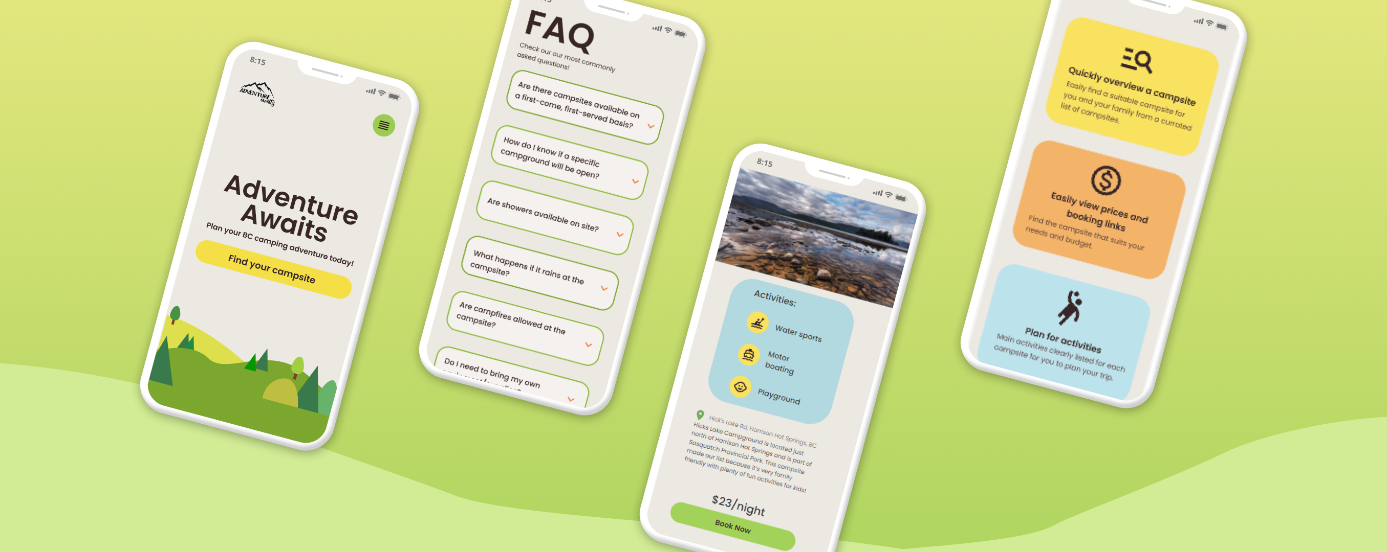
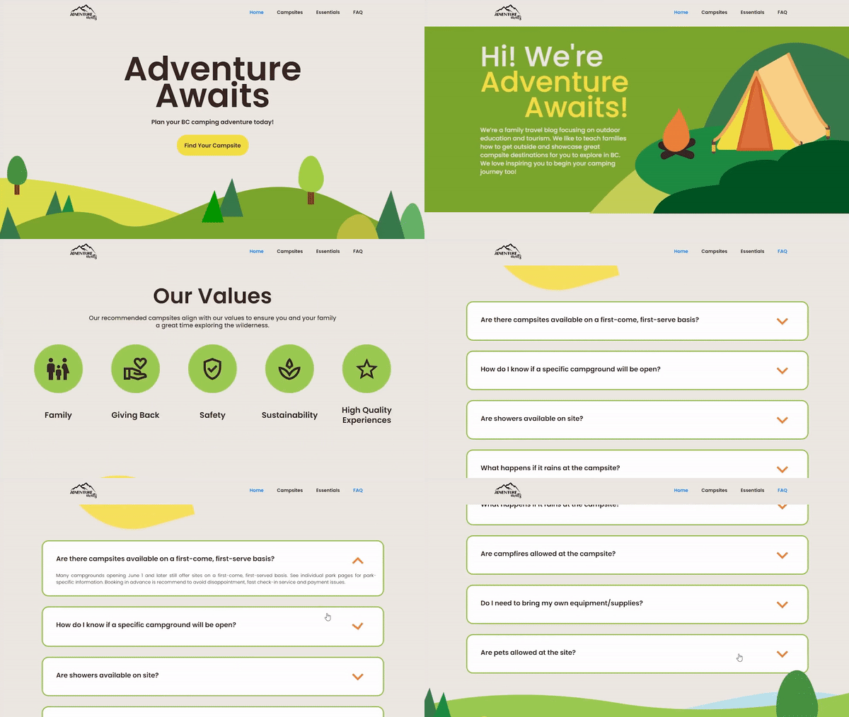
Adventure Awaits is a camping blog that provides family campers information to get their camping journey started. We created a microsite for BC campsites so that beginner family campers are able to easily find information and determine which campsite would suit their needs best, as the current site lacks organization and readability.
UI designer
UX research
Art Direction
Michelle Wang
Leanne Ngong
Jenise Cheung
Calvin Alexan
Jaival Shah
Figma
Webflow
July 2022-August 2022
The Adventure Awaits mictrosite was a project for an academic course at Simon Fraser University, with the goal of creating a microsite that would benefit a specific user group.
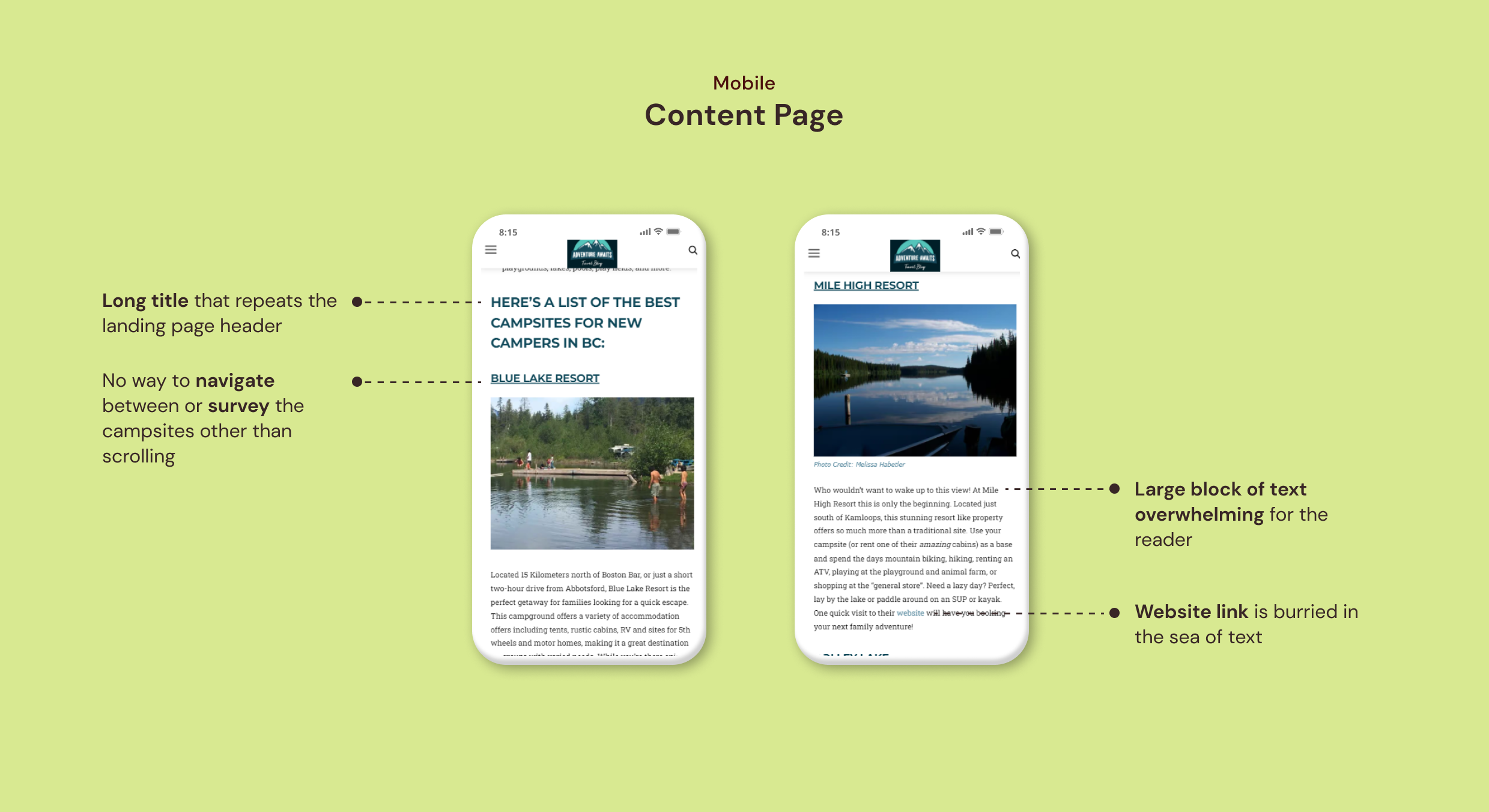
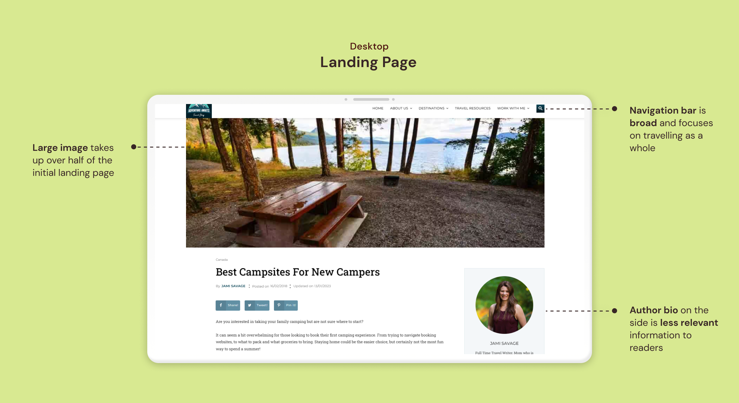
Our team started off with the online blog "Adventure Awaits". It is an eductional blog that aims to teach families the basics of camping. As a blog, it presents a lot of information that may be difficult to nagivate through as a beginner family camper.
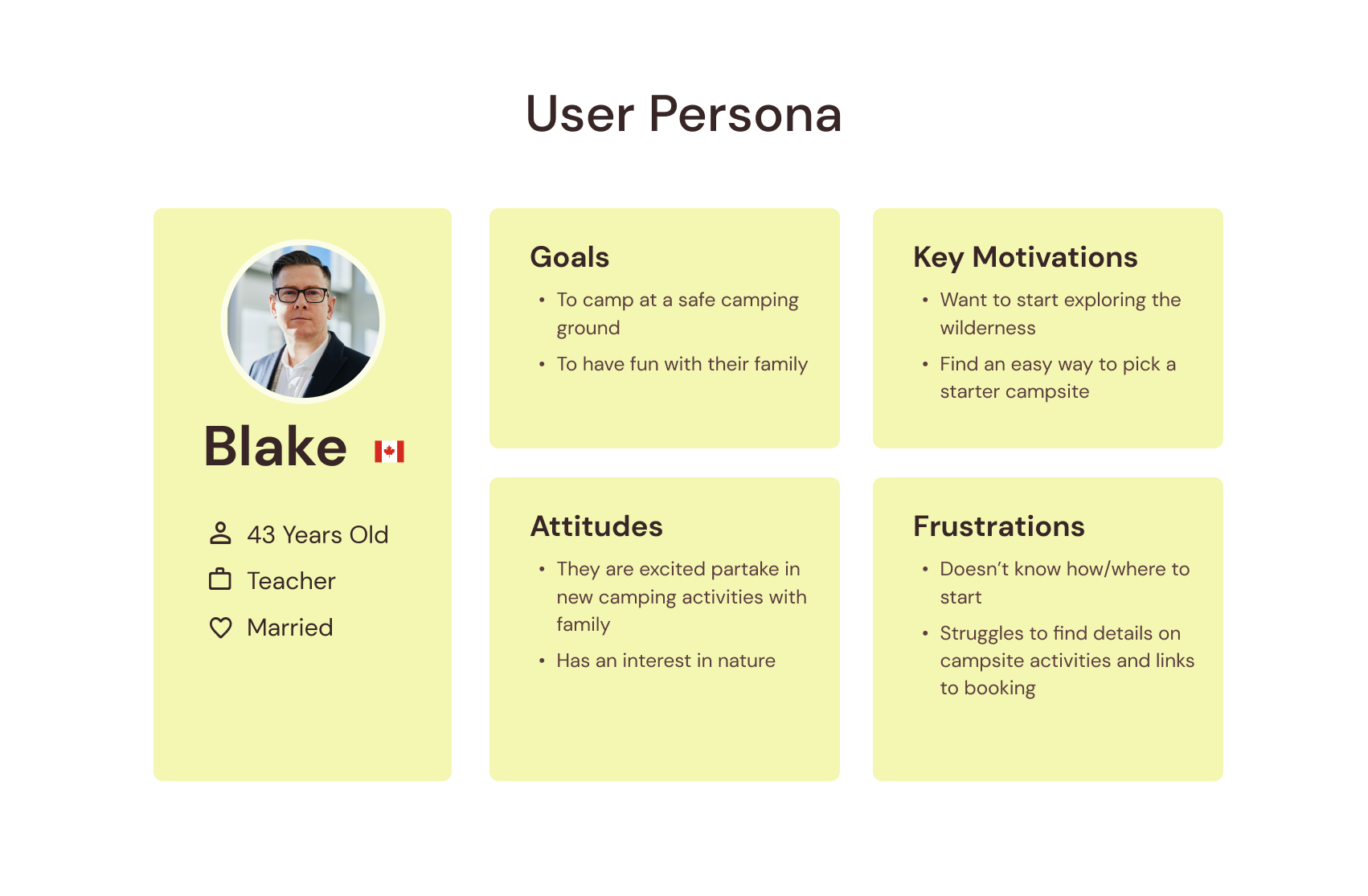
In order to have a grasp on who our target audience is, we created a user persona of a beginner family camper. I identified the key user motivations and frustrations that would help us guide our design decisions.
Restructure content so that important information is easy view and understand quickly
Only keep the information that has a purpose in helping users find the right campsite for them.
Convey that families with kids of all ages are welcome through visual direction and content presentation.
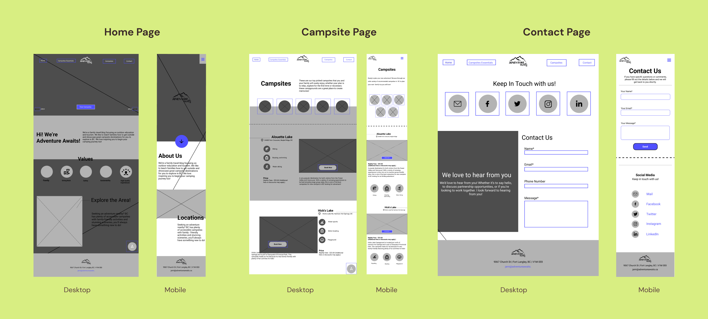
The team started our design process with basic wireframing of the content. I worked on the home page and campsite page, where I ensured that we made use of content hierarchy by extracting content into icons or headers, especially on the campsite page. This would help us communicate information in a less clutered way.
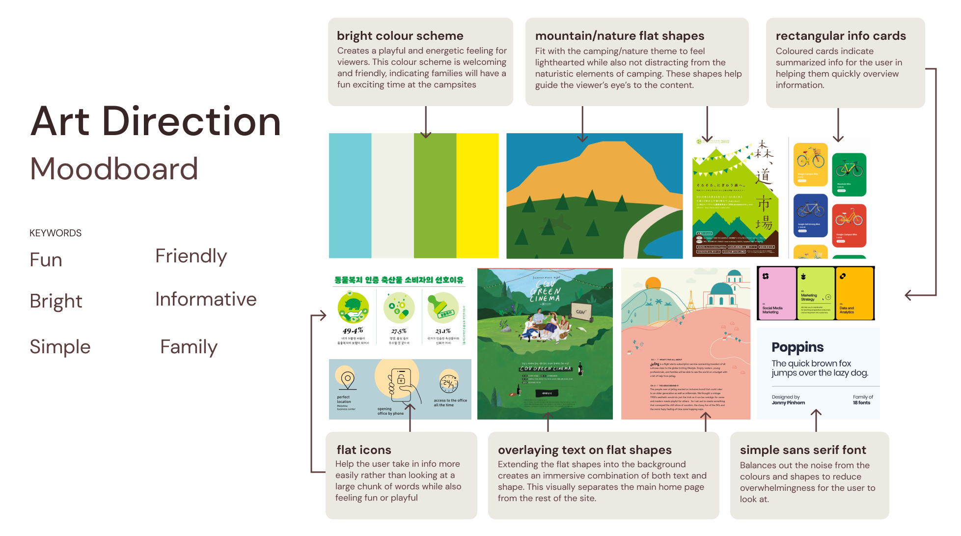
We began to currate the site art direction, with the goal of creating a welcoming experience for the whole family. I found relevant inspiration artifacts and developed the colour scheme to support our visual identity.
We received feedback from our Professor and Teaching Assistants that our wireframes had good structure, but there were a couple points that could use some revisions:
The contact page is less relevant to our content, as our site is primarily informative and serves as a resource for users. Including a contact page suggests users might inquire about campsite reservations, which is not our goal.
The rag for longer headers feels a bit unnatural, and the hierarchy relationship between content should aim to convey a similar structure across mobile and desktop.
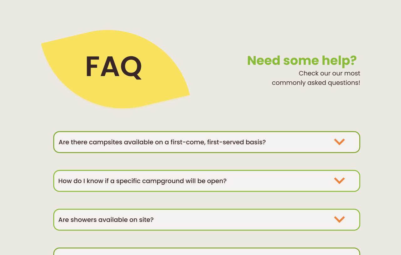
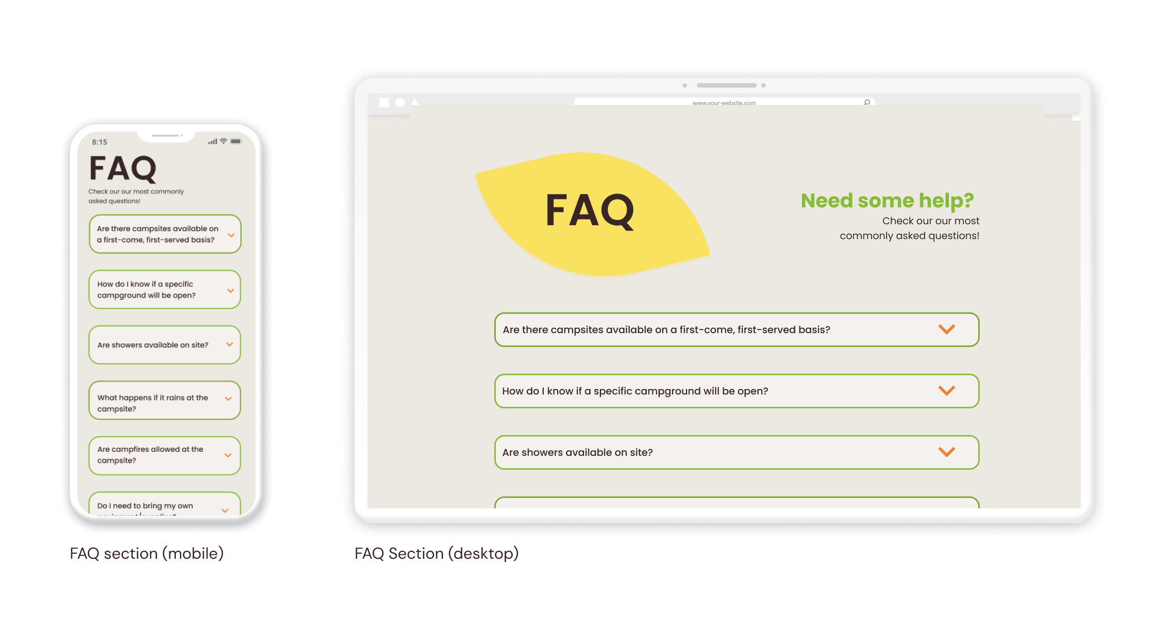
Initially, we added a contact page for user questions about camping. However, its purpose wasn't clear, which could lead to unintended inquiries. Therefore, we replaced it with a clear FAQ section for basic information.
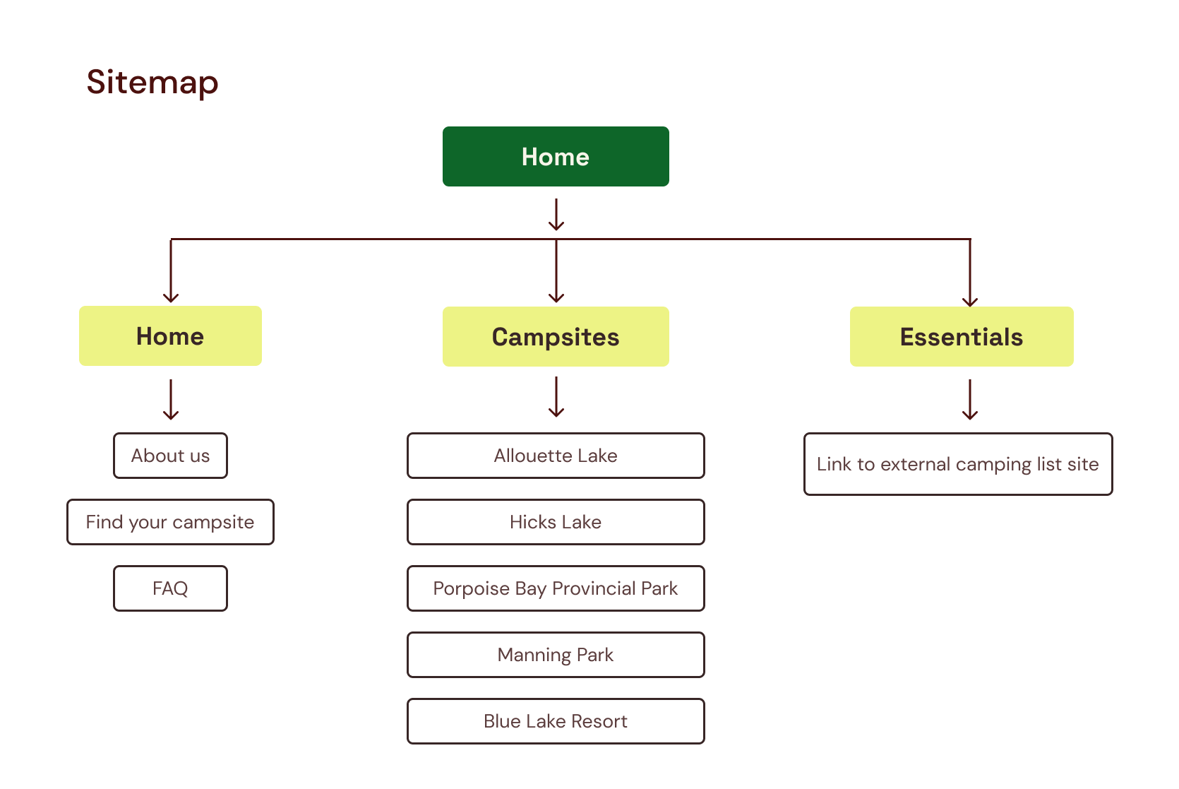
Removing one of the pages, I helped to create an updated site map to ensure the team was on the same page.
The content is currated to only include things that beginner family campers may need. We removed unnecessary sections like the contact page. All content on the site directly meets user's goals and has a clear purpose.
View the final website↗︎.
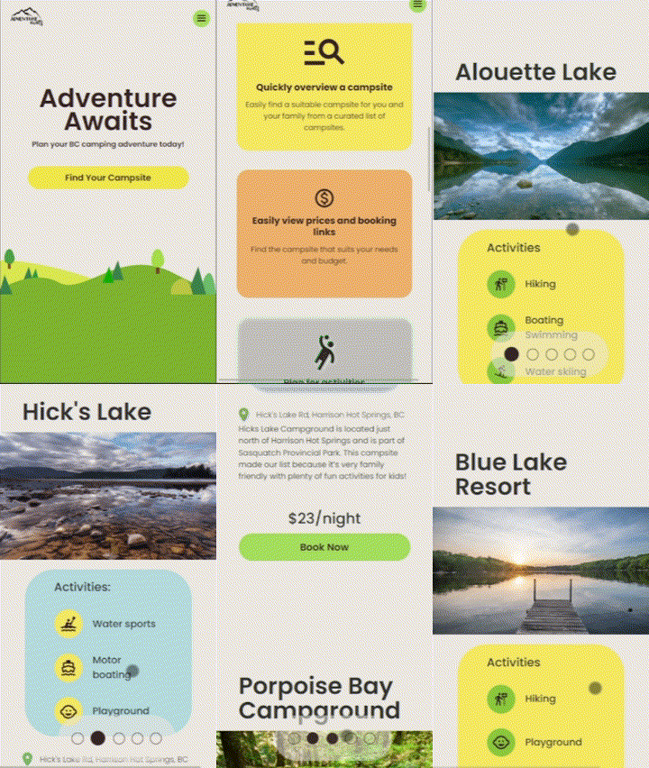
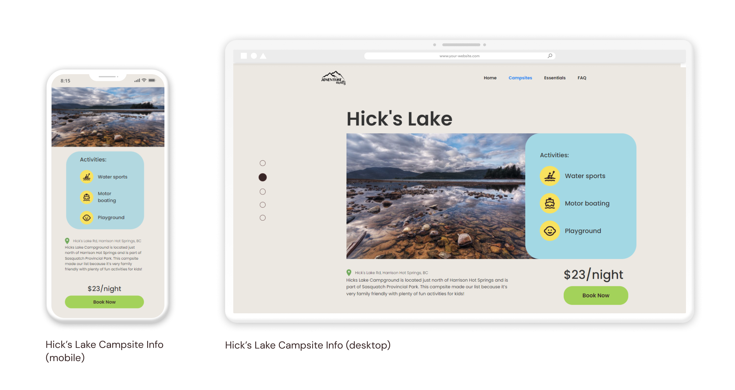
Key pieces of information are separated from text blocks. Main activities for each campsite are simplified through icons, prices are enlarged for quick scanning, and the booking link is presented as a distinct button for clarity.
Only essential content is shown in the campsite page. Each piece of content has a clear purpose to the user. This includes including an FAQ section rather than a contact page, and narrowing down the scope of the navigation bar.
Through this project, I further saw the importance of identifying target users. It was through our user group that was a main driver of our design decisions, and without it, the team would veer more on the generic side that would appeal less to who we would want to reach.
Another element that came to light was how the feedback from our peers and teaching team was crucial to our iterations and evaluating designs. Without outside feedback, it would be more difficult for the team to identify if we are meeting user needs or if the site was visually appealing and aligned with the art direction and user group.
What I would do differently next time would be to explore more possibilities of interactions. We were limited to just button state colours due to the time constraint; however, if we had more time, I would have like to experiment with hovering over site elements as another way to convey information to the users.